Tuesday, July 31, 2012

China's currency is not undervalued

After 18 years of an appreciating yuan/dollar exchange rate and a huge, $3.2 trillion accumulation of foreign exchange reserves, China's currency and forex reserves are roughly unchanged over the past year. This is a potentially important development, since it suggests that the yuan is no longer undervalued, and that China may be entering a new phase in its economic development, in which future growth is likely to be slower but more balanced.

In early 1994, China opted for a monetary policx that targets the value of its currency vis a vis the dollar. This is a legitimate policy option, but very different from the monetary policy that all other major central banks have adopted, which is to target short-term interest rates. In order to manage its exchange rate, China's central bank must buy and sell foreign currency depending on the balance of capital inflows and outflows to their country. If there is a net inflow of capital, the BoC must buy whatever excess of foreign currency there happens to be, thus adding to its foreign exchange reserves while at the same time expanding the supply of yuan in the economy; otherwise, the excess of foreign currency would depress the value of the yuan and violate the peg. Conversely, an outflow of capital would require the BoC to sell foreign exchange and shrink the supply of yuan, thus supporting the yuan. In this manner, capital inflows feed directly into an expanding economy and an expanding money supply.


For the past 18 years, China has experienced an almost relentless and massive inflow of capital. The inflow was so massive that the BoC was ultimately forced to revalue the yuan by 37% in several stages, following its initial 8.72 peg, as reflected in the blue line in the chart above. As China deregulated and privatized its economy, allowing the entrepreneurial energies of the world's most populated country to flourish, the world was quick to see the investment opportunities in China. Investment flows followed, and they were huge. This meant that the BoC had no alternative but to make massive forex purchases (red line in the chart above), and that was a good thing because the abundant supply of yuan this created provided the wherewithal for the Chinese economy to grow roughly 10% per year (in nominal terms, the economy increased a mind-boggling tenfold) as foreign investment inflows financed a booming Chinese economy.


By pegging the yuan to the dollar, China effectively "outsourced" its monetary policy to the U.S., and so it is not surprising that inflation in the two countries is virtually identical, especially now that the economy has had many years to adjust to its currency peg.


The chart above makes it clear that the yuan has been a relatively strong currency since the adoption of its dollar peg. Against a basket of currencies, and adjusted for inflation differentials, the BIS calculates that the yuan has appreciated by over 50% since 1994. Interesting factoid: since 1994, the yuan has depreciated by only 10% vis a vis the mighty Swiss franc, and it is unchanged against the franc for the past 8 years.

Moreover, the fact that reserves and the currency have been flat for the past year tells us that China's capital flows have reached a sort of equilibrium. No longer is there relentless upward pressure to revalue the yuan. Indeed, China could now argue that balanced capital flows are proof that the yuan is no longer undervalued against the dollar. The yuan has perhaps appreciated enough.

Presumably, the BoC could have stopped trying to peg the yuan to the dollar once China's forex reserves had reached some invincible number like $1 trillion. But it seems they wanted to go even further in order to convince the world that the yuan, like their economy, was serious, strong, and here to stay. So now, forex reserves total a little over $3 trillion, most of which is held in the form of dollar, euro, and yen-denominated bills, notes and bonds. Think of those reserves as the collateral backing up China's M2 money supply, which today is equivalent to about $12.5 trillion dollars. By comparison, U.S. M2 is only $10 trillion, and that is "collateralized" by the Fed's holdings of $1.6 trillion of notes, bonds, and MBS.


In the future, China should have no problem accommodating more economic growth with its current level of reserves—the lack of growth in reserves over the past year poses no threat at all to China's ability to continue growth. By simply by lowering banks' required deposit reserve requirement ratio, which is currently 20%, China's banking system can create all the cash and currency needed to support an expanding economy for years to come.


As the above chart suggests, China's galloping growth phase seems to have come to an end. To judge from the evidence of the past year—i.e., no increase in forex reserves and no change in the yuan/dollar exchange rate—no longer does the world in aggregate see obvious bargains in China, or excessive growth, or low-hanging investment fruit. This is likely due to a combination of factors: the yuan's strong performance relative to almost all other currencies; weaker growth in other countries, which translates into weaker demand for Chinese exports; and weaker growth in China, which dampens potential investment returns. Capital inflows have come to a halt because China is no longer the most attractive investment destination in the world.

At the same time as capital flows reach a kind nf equilibrium and growth cools, the world senses that the yuan is increasingly unlikely to continue appreciating, and this in turn means that speculative excesses are diminishing. If the yuan is going to be more stable in the future, then it makes less sense to speculate by buying the yuan or by buying Chinese assets. Investors increasingly must focus on things that make economic sense, and less on speculation. This takes some of the froth off of growth, and means that future growth is likely to be more balanced. The prospect of a slower-growing China may dampen one's enthusiasm for global growth in general, but that concern is offset by the likelihood that future growth will be more balanced, less speculative, and thus more durable.

Memo to Mitt: stop bashing the Chinese, please!

Why capitalism succeeds and redistribution fails

George Gilder, long one of my favorite business and economic philosophers, has written yet another brilliant essay, "Unleash the Mind," in which he explains how capitalism really works, why the redistribution of wealth only destroys wealth, and why increasing wealth is not a zero-sum game. Some choice tidbits from a rather long article:

America’s wealth is not an inventory of goods; it is an organic entity, a fragile pulsing fabric of ideas, expectations, loyalties, moral commitments, visions. To vivisect it for redistribution is to kill it.

Capitalism is the supreme expression of human creativity and freedom, an economy of mind overcoming the constraints of material power.

All progress comes from the creative minority. Under capitalism, wealth is less a stock of goods than a flow of ideas, the defining characteristic of which is surprise. If it were not surprising, we could plan it, and socialism would work.

Most of America's leading entrepreneurs are bound to the masts of their fortunes. They are allowed to keep their wealth only as long as they invest it in others.

In capitalism, the winners do not eat the losers but teach them how to win through the spread of information. Far from being a zero-sum game, where the success of some comes at the expense of others, free economies climb spirals of mutual gain and learning. Far from being a system of greed, capitalism depends on a golden rule of enterprise: The good fortune of others is also your own.
The secret of supply-side economics is not merely to incentivize people to work harder or accept more risk in order to gain a greater reward. The reason lower marginal tax rates produce more revenues than higher ones is that the lower rates release the creativity of employers, allowing them to garner more information ... command more capital ... attract more highly skilled labor ... reduce time and effort devoted to avoiding taxes ... conduct more experiments ... try more business plans ... generate more productive knowledge.

Read the whole thing, it's quite illuminating. HT: Ashby Foote


Upbeat economic releases

Today's economic releases were generally upbeat. No sign of anything that looks like a recession, just more signs of improvement in a variety of areas.


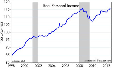
June Personal Income came in a bit stronger than expected (+0.5% vs. +0.4%), and it has increased 3.5% over the past year in nominal terms, and 2% in real terms. Government transfer payments accounted for only a small fraction of the June gains, so this is "real" improvement. In the first half of 2012, real personal income is up at a 4.4% annualized rate, which is comfortably higher than its 3.2% average growth rate over the 40 years leading up to the last recession. Plus, as the chart above shows, real personal income has now hit a new all-time high. That's one more in a growing list of indicators that now show a full recovery from the devastating 2008-9 recession. Personal income has traditionally not been a leading indicator, but when it posts numbers like these, it's not to be ignored.


Both the Case Shiller and the Radar Logic housing price indices have registered stronger-than-expected gains in recent months. The Radar Logic index (not seasonally adjusted) is now up 0.3% over the past year, while the seasonally adjust Case Shiller index is down only 0.7%. More signs, in other words, that housing prices are in a bottoming process.


As this chart shows, house prices have increased only marginally relative to rents over the past 25 years. Since mortgage rates are at all-time lows, house prices are looking very attractive relative to the cost of renting. The "bubble" in housing prices has burst, and prices are now back down to reasonably attractive levels.


The Fed's preferred measure of inflation, the Core Personal Consumption Deflator, is up 1.8% in the past year, and it has risen at an annualized rate of 2.0% in the past six months. No sign here of deflationary pressures that would warrant further quantitative easing measures. Indeed, this chart suggests inflation is right in line with the Fed's target.


This chart disaggregates the personal consumption deflator into its three main components. What stands out is that durable goods prices have been falling for the past 17 years. There is a lot of deflation in the durable goods sector, but this has been more than offset by rising prices for services (which are mostly driven by wages) and non-durable goods (e.g., food, energy). If you assume that service sector prices are a proxy for income, then incomes have risen by 120% relative to durable goods prices since the end of 1994. Put another way, durable goods prices have fallen by more than half relative to incomes. We've never seen relative price shifts of this magnitude. Ever. Not even close. Consumers have never had it so good when it comes to the purchase of durable goods such as computers, electronics, cars, etc. We can probably thank the Chinese and technological progress in general for much of this boon, since cheaper durable goods free up money that can be spent on other things.

Friday, July 27, 2012

Eurozone continues to make progress


Here's a quick update on some key measures of systemic risk in the Eurozone. Swap spreads in Europe have been declining all year, and although they remain somewhat elevated, they tell us that the ECB has managed to restore a good deal of liquidity to the banking system. Liquid markets are essential to an economic recovery. U.S. swap spreads remain very low, a testament to how much the U.S. economy has avoided Eurozone contagion.


The Eurozone has yet to solve its underlying problem (excessive spending), but as this chart of 2-yr sovereign yields shows, the risk of large and potentially disruptive defaults has receded significantly.

The economy continues to avoid another recession

Second quarter GDP was undeniably weak (1.5% at an annualized pace), but the more important news is that the economy continues to grow. With the market priced to dismal expectations (e.g., 10-yr Treasury yields at 1.4%, PE ratios below average despite record-setting profits, real yields on TIPS deep in negative territory) all it takes to cheer the market is evidence that the economy continues to grow and continues to avoid a recession.


GDP was upwardly revised a bit over the past three and a half years, but as the chart above shows, the economy is still about 12% smaller than it could have been if we extrapolate from the growth trend over the past 50 years. That 12% "output gap" translates into roughly a $2 trillion shortfall in national income—that's an awful lot of money and jobs that have gone missing. This is a real national tragedy, that we have experienced such a weak recovery. If there is a silver lining to this dark cloud, it is that we now know that running up annual deficits of well over $1 trillion per year (equivalent to a whopping 9% of GDP each year on average) for the past three years hasn't managed to help the economy at all. Indeed, it's likely that the deficits are to blame for most of the underperformance, because they served mainly to redistribute income and finance a lot of wasteful and unproductive spending (e.g., Solyndra et. al.). In other words, the government spending multiplier is probably negative; we would have been much better off without all that "spending."


One other important piece of news is that despite the economy's unprecedented (in modern times) output gap, inflation remains positive, and still close to the upper bound of the Fed's target range. Keynesian theory has thus suffered a double body blow in this recovery: government spending is not necessarily stimulative, and weak growth is not necessarily deflationary.


Indeed, even as economic growth has slowed this year, from a 4.1% annualized rate in Q4/11 to 1.5% in  Q2/12, forward-looking inflation expectations (as shown in the chart above, which plots the implied 5-yr, 5-yr forward inflation expectations embedded in TIPS and Treasury prices) have been rising, albeit modestly.

Thursday, July 26, 2012

Capex remains flat


New orders for capital goods, a good proxy for business investment, have been flat for the past year. This is somewhat discouraging, since it points to a lack of confidence on the part of businesses, and it portends reduced productivity growth in the future. But it's not necessarily a precursor to a recession. If anything, it simply reflects the well-known fact that the economy has been growing very slowly for the past few years, and it suggests that growth is likely to remain disappointingly slow for the rest of the year. No surprise.

Even though the lack of robust growth and the still-high unemployment rate are deeply disappointing, it remains the case—as I have been pointing out continuously for the past three and a half years—that the economy has been doing better than expected. The only thing that moves markets is the unexpected; if the market expects a recession but instead the economy grows a measly 1-2%, that is a positive. I've argued repeatedly that the market has been priced to very weak and even recessionary conditions, as reflected, for example, in the extremely low level of Treasury yields and the below-average level of PE ratios at a time when corporate profits have been extremely strong. So if the economy continues to grow slowly and avoids a recession, then equity prices are likely to continue to move higher.

Claims update: still positive


Weekly unemployment claims have been erratic in recent weeks, a sure sign of seasonal adjustment problems. It now looks like the typical auto industry layoffs that occur in July have been fewer than expected, so in a few weeks we should see the true underlying trend reassert itself, and it will likely prove to be still downwards. Although the number of people receiving unemployment insurance (second chart above) has ticked up in recent weeks, on a year over year basis (which eliminates seasonal variations) it has been declining at about a 15% rate for most of this year.

On the margin, these timely indicators of the health of the economy continue to be positive. As the chart below suggests, the gradual improvement in the level of weekly claims has been helping to guide the equity market higher.


Wednesday, July 25, 2012

The global yield plunge


As this chart shows, refinancing activity has been very strong and on the rise since early last year. I should know, as we are just finishing our second refi in the past 12 months. With a new 30-yr mortgage, our monthly payments will now be almost 30% less than they were a year ago. That frees up cash for all sorts of things, and if rates ever go back up, I'll feel like I've won the lottery. And if they should continue to fall, well then, I'll just refinance again. I keep thinking that someday I'll look back and congratulate myself for locking in a historically cheap rate (and tax deductible too!) on 30-yr money. There might never be another opportunity to borrow money at a fixed, after-tax cost of only 2-3%.

The other side to this coin is that the person lending me the money has seen a big reduction in his interest income. Actually, there is a massive amount of money all over the world that is being forced into lending at lower and lower interest rates. Most mortgages can be refinanced relatively easily when rates fall, but when rates rise, mortgages turn into long-maturity bonds because homeowners have a disincentive to move or refinance. Lenders thus see their MBS holdings behave like short-term deposits when rates fall, and like long-term bonds when rates rise—it's a painful experience.


And it's not just in the U.S. that yields have collapsed. As the first chart above shows, 10-yr sovereign yields in the U.S. and Germany are rapidly approaching the super-low level of Japanese yields. Who would have believed this could happen? I've been dead wrong on my prediction several years ago that Treasury yields would be much higher than they are today. And it's not because inflation has dropped or that deflation threatens; inflation expectations embedded in TIPS and Treasury prices are firmly in the range of 2 - 2.5%, which is very much in line with what inflation has been over the past 10-15 years.


The yield on 10-yr Treasuries, which is the principle driver of fixed mortgage rates, is down not because the Fed has engaged in quantitative easing or "operation twist," but because yields everywhere are falling.


The world's major central banks are the proximate driving force behind the global yield plunge. As the chart above shows, they have pegged short-term rates to near-zero for over three years, and no one even hints at raising rates anytime soon. Why? Because markets and central bankers all believe that global growth is going to be very disappointing, and easy money is believed to be the only policy lever that might work to stimulate growth. Fiscal "stimulus" spending has been tried and it has failed. But never mind: as Treasury Secretary Geithner made clear in a speech today, "The economy is not growing fast enough. Unemployment is very high. There's a huge amount of damage left in the housing market. Americans are living with the scars of this crisis. The institutions with authority should be doing everything they can to try to make economic growth stronger ..."

Central banks can influence bond yields by the manner in which they target short-term interest rates and future expectations of short-term interest rates: if they say, as they have done for years now, that short-term rates will be kept low indefinitely in order to combat pervasive economic weakness, then yields all across the maturity spectrum will experience a strong gravitational pull downwards. The only thing that can push rates up is faster growth and/or a reversal of demands for policy stimulus.

What the history of low rates and disappointingly slow growth should tell us, however, is that easy money (e.g., very low short-term interest rates) doesn't stimulate growth. How are low interest rates going to create jobs, when fiscal deficits are gobbling up a gigantic amount of the global economy's resources? (One easy illustration of this is the billions of dollars that the U.S. government has poured into "green" industries that have yet to produce anything profitably.) In the U.S., our federal deficit has effectively absorbed every dime of total after-tax corporate profits for the last several years. Keeping interest rates low only facilitates government borrowing, while at the same time transferring wealth from savers to borrowers.

It's become a vicious circle of sorts: government spends more than it takes in and borrows the difference; excessive spending weakens the economy because much of it takes the form of transfer payments and inefficient spending; the weak economy prompts central banks to keep rates low; and lower rates facilitate more wasteful borrowing. Meanwhile, savers accept the lower rates because they have no confidence that things will improve; witness the huge, $2.3 trillion increase in savings deposits in the U.S. in the past four years that pay almost nothing.

Lower interest rates aren't going to stimulate the economy. They are better thought of as barometers for how weak the economy is perceived to be. This is not going to change in any meaningful way until policymakers—with the prodding of markets—realize that the way to get out of this vicious circle is to cut back on the size and scope of government. The sound and fury coming out of the Eurozone these days is all about this: governments and their constituencies fighting the efforts of markets to impose healthy fiscal discipline. The only countries where yields are rising are the ones (e.g., Spain) where markets see that spending and borrowing are on a collision course that can only end in tears. Fortunately, the bond market vigilantes have driven Spanish yields up to levels that will make it very difficult for the government to avoid the inevitable cuts in spending. This is how it should be.

Monday, July 23, 2012

The message of TIPS: extremely weak growth ahead


If you had been stranded on a desert island for the past 10 years and the first thing you saw upon returning to civilization was the chart above, you would most likely figure that dollar inflation must be very high. Why? Because with the real yield on TIPS at its lowest level ever, and firmly in negative territory, you would know that the price of TIPS was at a record high level; and from there it would follow that if investors were willing to pay an unprecedented price for TIPS, then the inflation protection afforded by TIPS must be in very high demand, and therefore inflation must be very high and/or threatening to be very high.

But you would be wrong.


As these two charts show, the expected rate of inflation that is priced into TIPS and Treasuries is relatively low and very normal. The top chart shows the break-even expected rate of inflation over the next 10 years, and it is the difference between the nominal yield on 10-yr Treasuries and the real yield on 10-yr TIPS. The bottom chart shows the 5-yr, 5-yr forward expected rate of inflation, as derived from the pricing of 5- and 10-yr Treasuries and TIPS, and as calculated by Bloomberg. This measure is also the Fed's preferred measure of inflation expectations, and it reflects what investors expect inflation to average over the period 2017 through 2022. The 10-yr expected rate of inflation is now 2.12%, and the forward expected inflation rate is 2.65%. Both compare very favorably to past inflation: the CPI has risen at a compound rate of 2.6% over the past 2 years, 2.0% over the past 5 years, and 2.4% over the past 10 years. Nothing unusual at all about these numbers.

So if the real yield on 10-yr TIPS is at amazingly low levels, but inflation expectations are very normal, what then does the top chart tell us? Actually, it tells us nothing, since to fully understand the message of TIPS pricing you have to also know the price of Treasuries of comparable maturity. That's what the second and third charts in the post show. If TIPS are extremely expensive, but inflation expectations are normal, then the real message is that interest rates in general (both real and nominal) are extremely low. And why are interest rates in general extremely low? The only logical answer is that investors believe that the outlook for the future is very weak growth and average inflation for as far as the eye can see. Very weak growth, as in the weakest growth we've seen on average in my lifetime.


So TIPS aren't really saying anything unusual about the outlook for inflation, but they are saying that the outlook for growth is dismal. Investors are buying TIPS with the full knowledge that they are going to give up purchasing power (as a direct consequence of negative real yields) in the future in exchange for the default-free nature of TIPS (with the exception of TIPS maturing more than 20 years from now, since those real yields are still marginally positive, as seen in the chart above). You buy TIPS today because you figure you would rather lose purchasing for sure, rather than risk losing even more by buying virtually anything else, or even by just holding on to cash or currency.

The message of TIPS is that the market has an extremely pessimistic outlook for the future: pessimism rules. Which of course means that you don't have to be very optimistic about the future to be a bull these days.

UPDATE: I should add that I continue to expect the economy to grow, albeit at a relatively slow pace. Although this would leave the unemployment rate very high, and jobs growth relatively low, I believe my outlook places me well to the optimistic side of the dismal expectations built into current market prices.

Plus, my comment from below bears repeating here: "If the high prices of TIPS reflected huge demand for inflation protection, then Treasury prices would have to be much lower, and the spread between TIPS and Treasury yields would have to be much higher. In other words, we would have to see relatively high inflation expectations if the demand for inflation protection were relatively high. But that's not the case.

Moreover, the extremely low level of all interest rates, coupled with inflation expectations that are simply average, can only be intrepreted to mean that the bond market is effectively expectating economic growth to be extraordinarily weak for as far as the eye can see. Rates are low because the economy is expected to be very weak, and the market rationally expects that very weak growth will force the Fed to keep rates very low for a long time.

Friday, July 20, 2012

Eurozone update: it's not as bad as many think

With markets swooning yet again over eurozone fears, it's time to revisit spreads and yields for a look at just how likely a default or disaster is likely to be, according to market pricing. As should be apparent, the fears are much worse than the facts.


First, a look at 2-yr sovereign yields, which are a decent barometer for the likelihood of a near-term default. What stands out in this chart is how much things have improved in Portugal and Ireland. It was almost exactly one year ago that yields on Irish and Portuguese debt exploded skywards. Since then they have settled back down quite a bit, with Ireland now trading through Spain and approaching Italy. Who would have thought there could be such a dramatic change in Ireland's fortunes? (It helps that Ireland has been serious about reining in government spending while keeping tax rates as low as possible.) Portugal was thought to be a basket case sure to follow in Greece's footsteps, but Portuguese debt spreads now trade within the realm of high-yield corporate debt: 5-yr Portuguese CDS spreads are about 800, with the average high-yield spread being 580.

Another thing to focus on is the amount of outstanding debt in each of these countries. At $900 billion, Spain's debt is a serious chunk of change. Spanish debt is trading between 70 and 90 cents on the dollar, so the market has already priced in something like a 20% default. If Spain goes all the way over the cliff, its debt might suffer a 70% haircut in a worst case scenario (Greek debt has suffered a loss of about 85%), which would mean wiping out an additional $450 billion of debt. But: would that be enough to bring on the end of the world as we know it? Considering that there is something like $50 trillion of debt in the world, so even a disastrous Spanish default would be only a drop in the bucket.

And as I argued a year ago, the money that the Spanish government borrowed was long ago wasted. Whether the government ends up defaulting on its debt or not, serious losses have already been incurred because the money was effectively squandered. In a true economic sense, the losses are water under the bridge. All that remains to be seen is who will be stuck with writing off the losses on their balance sheet. So the angst over potential debt defaults is overdone, and the reality of a default is likely to be much less awful than most people imagine.


Eurozone 2-yr swap spreads are now back to where they were about a year ago, and down significantly from the highs of late last year. This represents a substantial improvement in the health of the Eurozone financial markets and banks' liquidity. This is not at all consistent with fears that a Spanish default could bring down the eurozone banking industry. Moreover, euro basis swap spreads are closing in on relatively healthy territory, suggesting that Eurozone banks have reasonably good access to dollar liquidity. Spreads are still elevated, to be sure, but nothing here is even close to suggesting a near-term collapse. Meanwhile, U.S. swap spreads remain low, with financial markets in the U.S. clearly avoiding any Eurozone contagion.


Finally, although the euro has been falling in the past year, it is hardly a catastrophic decline. As the first chart shows, the euro is now equal to its average against the dollar since the euro's inception. And according to my estimate of purchasing power parity, the euro is still somewhat overvalued against the dollar. This is not what you would expect to see if the eurozone were on the verge of disaster.


Thursday, July 19, 2012

Let's end discrimination

When I was in sixth grade, back in the mid-1950s, I was taught that the color of one's skin didn't make any difference, that we were all the same. It made sense to me, and I brought up my own children to understand the same. At some point in the future, I explained, all the races and all the ethnicities would be commingled—it is inevitable given the ease of travel in modern society. Yet here we are, over 50 years later, still taking census counts of how many of us are white, brown, black, or whatever. We keep insisting on identifying our racial origins, and classifying ourselves by language, religion, and sex, but to what end? If we are going to stop the discrimination, we need to stop the counting and the classifying. Aren't we all just Americans? Free to pursue our own vision of happiness?

The Democrats are hell-bent on raising taxes on "the rich" but not the middle class, even though higher taxes on the rich would only amount to a fraction of our current $1.2 trillion deficit, and even though the hardest-working of the middle class would likely aspire to be rich some day. The Republicans want to avoid raising taxes on anyone, arguing that this might endanger the fragile recovery. Unfortunately, both parties are missing the more important point: using the tax code to discriminate between one person and another is just plain wrong.

It's wrong to discriminate on the basis of race, color, ethnicity, or religion, and it's just as wrong to discriminate on the basis of one's income or capital gains. It's wrong to discriminate on the basis of whether a couple is married or not, or whether they have children or not, or whether they rent or own their home, or whether they make more than $250,000 or not. We need to greatly simplify our tax code by not discriminating on the basis of anything. We need to make sure that everyone has an equal opportunity to succeed, but we need to stop punishing those that do and stop rewarding those who don't.

If the tax code distributes favors to every favored interest group, at the expense of any minority group, we only end up being a nation of special interests pitted against each other.

The more we discriminate on the basis of anything, the more incentive our politicians have to pander to special interest groups, and the more divided we become. This will be the death of us if we don't stop it.

Claims update


Weekly claims jumped last week, but only on a seasonally-adjusted basis. This confirms widespread suspicions that faulty seasonal adjustment factors (i.e., reality not conforming to assumptions, with the focus here being on the timing of scheduled auto industry layoffs) were behind the huge drop in claims the week before. What we are left with is a modest uptick in claims that is of the sort that happen now and then, and it probably has something to do with the fact that economic growth slowed in the second quarter.

Meanwhile, the number of people receiving unemployment insurance continues to decline: there were 15.8% fewer people on the dole last week than there were a year ago. This could well be the more important number to focus on, since it means that there are more and more people losing their unemployment benefits and thus gaining a new-found motivation to look for and accept employment—perhaps a less-than-ideal job, but a job nonetheless. Changes on the margin like this can be good for the economy down the road.

Wednesday, July 18, 2012

Housing starts up over 40% in past 18 months


This chart provides good evidence that housing starts have turned up in a big way. Since Dec. '10 (which I've marked with a green line), starts are up 41%, or at a 25.7% annualized rate. Of course, the level of starts is still miserably low (they fluctuated between 1 and 2 million from 1968 until the current recession), but the gain in the past year or so has been signficiant. The recovery in residential construction is upon us, and it is for real.